Monday, 19 May 2014

Final Critical Analysis: Change of State

To round off the project, I will provide a critical analysis of my final animated sequence.

To recap, the aim of the project was to choose a theme relating to 'Change of State' and produce an animation to answer our chosen theme. I chose the theme 'Human to superhero'.

First, I will review the process I went through to produce my final animation. In terms of efficiency and management of workload, I feel that it was a success. I produced the animation in five distinct stages; keys, rough animation, details, colours and effects. I feel that I managed each of these stages in a controlled and efficient manner. One aspect that kept things going smoothly was my decision to incorporate the soundtrack from the offset, so I never lost track of what I was supposed to be animating.

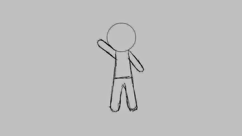
Stage 1: Animation Keys


Now, I will analyse my character designs and animation style. I designed characters that are straightforward, but have a lot of potential for facial and physical expression. The use of bold lines and simple shapes allowed for characters that are both easy for the audience to relate to and easy for me to animate.

Stage 2: Rough Animation

In order to better manage my workload, I also made use of limited animation. This decision came as a result of the previous Animated Cycle brief, in which I insisted on drawing every frame by hand. This was not only laborious; it took a lot of time. Time is money in the animation industry, and though I managed to submit it on time, I might have lost a lot of money if it had been a professional submission turned in late. By using limited animation in this brief, I was able to finish the piece an entire week before it was due for submission.

Stage 3: Details

As well as lightening the workload by a significant amount, my decision to use limited animation allowed me to focus on the silhouettes of the characters and make sure that their poses and body language were dynamic. The use of flat colours also keeps the animation clean and uncluttered, which allows for clear communication, an essential thing to consider when animating.

Stage 4: Colours

This project was also a learning experience for me, as it was the first time I had experimented with filters and graphic symbols of multiple frames. I had a lot of trouble with getting the glow filters to look right, and it took a lot of trial and error. As stated in a previous post, I achieved the final result completely by accident, but the information I gained from this happy accident will serve me well in later projects.

Stage 5: Effects

Now I will look at how the soundtrack and the animation compliment each other. I was originally going to use a different piece of music, but I changed my mind because the music I used was the perfect length for the animation and suited the subject matter much better (I was even told that the music I used perfectly suits a superhero). The dynamic, over-the-top nature of the music also works with the dynamic, over-the-top nature of my characters' movements. By working out the animation keys in conjunction with the music, the action was solidly grounded, and it also made animating easier.

The final result is one I am incredibly pleased with

The overall look and feel I was going for, in terms of design and animation, was that of a television cartoon for children. Based on feedback I received throughout the project, I neatly managed to achieve this, which I am pleased about. As far as I know, there is a lot of work in children's entertainment, and if I can develop my skills in that sort of area, I should stand a good chance of getting a job in the animation industry.

Overall, I believe that this project was a resounding success. I learned a lot of new skills and techniques for animating in Adobe Flash while correcting the mistakes I made in the previous animation project. In the group critique of our finished animations, the tutor found nothing wrong with my submission. As well as learning a lot about Adobe Flash, I also learned a lot about myself as an animator. It seems that my strengths lay in limited animation; it would do me a great service to try and break this personal boundary, but for now, further strengthening my grasp of limited animation will serve me well.

Characterisation and Influence on my Animation

For this reflective task, we have to consider what characterises and influences our individual styles of animation, and to consider which animators we admire and why.

I have Language and Communication Disorder, so I need things to be made more clear to me to understand. I suppose that through animation, I can turn my disability into an advantage, as in making something clear to me, I can make it clear to a vast majority of people.

Clarity is the key aspect I strive for when animating, therefore I believe that clarity and ease of communication are what characterises my work. I always try to ensure that the animation I am making can be understood, and enjoyed, by anybody. I feel that clarity is one of the most important things to consider in animation. If an animation is too complicated or opaque, the viewers' enjoyment may be compromised.

My views on animation are reflected in my art and animation styles. My character designs are straightforward, allowing the viewer to easily identify with the character. When animating, I make use of limited animation and bold movements to ensure that the appeal of the character is not lost or otherwise detracted.

In terms of influences on my animation, the work of Disney, Pixar, Cartoon Network Studios, Warner Bros. and Hanna-Barbera have been sources of inspiration to me for their clarity and devotion to characterisation since I was very young. More recently, I have been influenced by the work of Frederator Studios for their straightforward design and crisp animation.

Adventure Time with Finn and Jake - Produced by Frederator Studios

I am also regularly influenced by Japanese animation studios such as Studio Ghibli, A-1 Pictures, Madhouse and Wit Studio. As with the previously mentioned studios, these Japanese studios also make clarity their operative word, while also producing work that is arguably more dynamic than that of their western cousins.

Princess Mononoke - Produced by Studio Ghibli
Sword Art Online - Produced by A-1 Pictures
The Girl Who Leapt Through Time - Produced by Madhouse
Attack on Titan - Produced by Wit Studio

Wednesday, 14 May 2014

Change of State: Final Animation

After one whole month of work, my superhero animation is finished.


After producing the rough build of the animation, I worked on finalising the lines (that is to say, redrawing them as solid black lines) and adding colour and special effects. There were a lot of layers to navigate, and there were several instances in which I accidentally started drawing or colouring on the wrong layer. Those mistakes were relatively easy to fix, but the real difficulties came from the timing and the special effects.

I had a bit of trouble trying to get the timing right. I could not get past the fact that the final pose seemed to come too late. In the end, I cut two of the inbetween frames from the last little sequence of movement and the timing worked out just fine. The special effects were more complicated. I basically wanted to give the impression of bright, glowing light as the superhero transforms and then a bright flash as the transformation finishes.

I discovered the solution completely by accident. I had been wrestling with the glow filter for hours, trying to make it expand just big enough to make the transformation seem more impressive without the glow effect looking terrible. Eventually, I took a break from it to sort out the transition of the background, which fades to grey as the transformation starts, back to white. The combination of the expanding glow effect and the background fading from grey to white perfectly created the effect I had been trying to achieve all along. I think that this happy accident is one of the crowning glories of this animation.

Thursday, 8 May 2014

Research Task: Comparing Andreas Hykade and Bill Plympton

For this research task, we have to compare and contrast Andreas Hykade's 'Love and Theft' with Bill Plympton's 'Your Face', and see if we can think of any other animations in which 'change of state' could be a theme.

Screenshot from Bill Plympton's Your Face, displaying the character's face 'wrapping' around itself

To start, I will take a look at Bill Plympton's 'Your Face'. Much like Hykade's 'Love and Theft', the content of 'Your Face' is heavily psychedelic. Where 'Your Face' differs from 'Love and Theft' is how its psychedelic nature is presented. 'Your Face' features a singing man's face warping and twisting into different shapes, his entire head dissipating and reconstructing, his features stretching to grotesque sizes. This method of playing with the human face, possibly the most recognisable thing in the world, creates a sense of unease on a level that is arguably more personal than 'Love and Theft', which uses a combination of strange shapes, colours and music to play with the viewer's senses.

Screenshot from Andreas Hykade's Love and Theft

Adding to the more personal nature of Plympton's 'Your Face' is the fact that the whole animation has been hand drawn with pencil and pencil crayons, similar to the famous animated adaptation of Raymond Briggs' 'The Snowman'. The overall effect is one that is gentle and pleasingly messy, which only adds to the strangeness of the piece. In direct contrast, Hykade's 'Love and Theft' appears to have been produced digitally, and uses harsh colours, clean lines and smooth inbetweens. This is possibly a reference to the entertainment industry.

Title card for the Ninjas animation series

https://www.youtube.com/watch?list=FLTKpxG-Sr9RbE7ZtLT_RngA&feature=player_detailpage&v=VRudsOaEpmg

One animation I remember seeing a while ago that had 'Change of State' as part of its themes is 'Ninjas', produced for the Youtube gaming network The Yogscast by Youtube animator 'balbod'. The link above goes to the sixth episode of the series, in which the character of the Burrito Bushido (voiced by Chris Lovasz, also known as 'Sips') is pushed into a machine that transforms him from an overweight blob into a muscle-bound martial artist. The contrast between the 'before' and 'after' states of the character makes the transformation both amusing and memorable, and acts as a strong turning point in the story of the series.


Research Task: Andreas Hykade and 'Love and Theft'

For this task, we are meant to look at the work and career of animation director Andreas Hykade and to analyse his short film 'Love and Theft', which was shown at the 2010 Bradford Animation Festival.

Andreas Hykade is a German animation director. Born in Altotting, Bavaria in 1968, he studied at the Academy of Fine Arts in Stuttgart from 1988 to 1990. From there, he worked as an animator in London in 1991 before going back to his studies, studying animation at the Filmakademie Baden-Wurttemberg. As an animation director, he works at Studio Filmbilder in Stuttgart and as the Professor of Animation at Filmakademie Baden-Wurttemberg, as well as teaching animation at Harvard University.

Screenshot from Andreas Hykade's 1995 student film Wir Lebten im Gras (We Lived in Grass)

Hykade is well known for his films known collectively as The Country Trilogy. The first in the trilogy, 'We lived in Grass', is a student film produced in 1995 by Hykade that recieved numerous awards. The following two entries in the trilogy, 'Ring of Fire' and 'The Runt', were similarly praised. As a whole, the trilogy appears to address themes of masculinaity and the myths surrounding the concept.

Screenshot from Andreas Hyakde's Love and Theft, submitted to the 2010 Bradford Animation Festival

Looking at his film 'Love and Theft', I made the assumption that it is about ownership and copyright. I came to this assumption because the content of the film mostly consists of the faces of copyrighted characters melting into each other. Several characters from the likes of Disney and Warner Bros can be seen. Another possible theme of the animation could be "express yourself, but remain true to yourself". The psychedelic nature of the animation allows for innumerable interpretations, and it is my assumption that this was Hyakde's intention when producing 'Love and Theft'.

Friday, 25 April 2014

Change of State: Rough Animation


I have produced a rough build of my 'Human to Superhero' animation, which can be viewed above. I worked out the in-betweens of each key frame and added a classic tween to create the effect of the character floating upwards. With the rough animation in place, I can now work on finalising the animation and adding colour.

NOTE: For some reason, Blogger cut off the last second of the video when I uploaded it. Sorry about that.

Change of State: Animation Keys


I have produced animation keys for my 'Human to Superhero' animation. I started by downloading the song I used as the soundtrack. Then I used Audacity to trim the song down to the right length and loaded the edited song into Flash. With the song in Flash, I could sync up the keys to the parts of the song that are pivotal to this animation.

The soundtrack in the animation is part of the theme song for the computer game Awesomenauts. Awesomenauts was created by Dutch indie developer Ronimo Games and the theme song was produced by audio studio Sonic Picnic, which is local to Ronimo Games. I was originally going to use a piece of original music that the Youtube channel Hat Films use as the intro jingle to their gaming videos, but I went with the Awesomenauts theme song because I thought that it better suited a superhero, and the part of the song I used fits perfectly within the 8 seconds time frame.

Research Task: Bradford Animation Festival

To get an idea of what the client in this brief is looking for, we were tasked with looking at and analysing past submissions to the Bradford Animation Festival.

Looking at some of the examples of previous entries and winners of the Bradford Animation Festival, I had not realised just how diverse the entries to the festival can be. There was professional content as well as amateur work, student films and even work done by children. The diversity of media is also remarkable, covering traditional, CGI and stop motion, among others.

Though the Bradford Animation Festival website does not always give access to the full versions of the films, I can get a good feel for what they are like through the trailers. What I picked up on is that an animator can submit pretty much anything they like, so long as their own ideas and unique style come through in the final piece.

I found the piece titled 'Women's Letters' by Augusto Zanovello particularly interesting. It was an unusual concept; a stop motion animation in which a field medic in World War I uses the letters of beloved women to treat the wounds of the paper soldiers. I assume that the idea behind this is that their letters from home helped give the soldiers on the front lines the emotional strength they needed to keep fighting despite abject despair.

If I can think of an unusual slant on the 'Human to Superhero' transformation theme, I should be able to create an original answer to the brief (and maybe even have a contender for the BAF).

Thursday, 24 April 2014

Change of State: Initial Ideas

I was absent on the first day of the brief, so I did not know what themes my group had gone with. My first idea was to animate a selkie transforming from a seal into a human, but it became defunct when I found out that the two themes my group were using had already been decided on; 'Human to Werewolf', and 'Human to Superhero'. Finding the idea of 'Human to Werewolf' rather boring, I instead went with 'Human to Superhero'.

Development sketches for my original 'Selkie' idea

I went with the 'Human to Superhero' theme because I thought it would suit my brighter, more 'bouncy' style more than the darker theme of 'Human to Werewolf'. I decided to use an original character I have had for as long as I can remember, a teenage superhero who goes by the identity of Mega Boy.

Development sketches and notes for the 'Mega Boy' character and animation

One element of the design I wanted to get right was the character's body shape. I wanted the character to be visually appealing, yet easy to animate. As can be seen in the notes on the upper right and lower right corners of the image, I decided from the start that I wanted the animation to have a soundtrack as well as special effects.

Turnaround sheet showing final designs for the 'Superhero' and 'Human' versions of the character

I finalised the designs of the character very quickly, and I am very happy with the results. My tutor even told me that she could imagine him being in his own children's television show, transforming all the time. This kind of feedback has given me even more confidence in my designs, and I feel that they will translate perfectly to animation.


Visual Literacy Animation Brief: Change of State

For this brief, we are back in our agency groups, only this time we each have to produce an animation (minimum of 8 seconds in length) as if it were to be submitted to the Bradford Animation Festival into the Professional Films category. The theme is 'Change of State', and there is a selection of themes to base our animations around; each group selects up to two themes for each of their members to work on. I am looking forward to this brief, because I have been leaning more and more towards the animation side of this course, and I am eager to develop my skills further.

Tuesday, 25 February 2014

How I Construct an Image for Work

When I am designing a piece of art for work, such as for a university brief, I start with a pencil sketch. I feel that drawing in pencil gives me much more control over how I want the design to look and feel, as well as making me more engaged with the art.

For this example, I will use a design I came up with for the graffiti-style stickers brief in Applied Creativity.


The initial design is roughed out in pencil on paper. As previously mentioned, this allows me to be closer to the art work and gives me a better understanding of how the finished art will look and feel.


When I am happy with the design, I go over the outline of the sketch with bold line. This gives me a more solid and reliable base on which to build the rest of the image, but is also the most time-consuming part of the process due to the high level of accuracy I insist on.


After the outline is done, I work out the details of the image; in this case, the writing inside the outline. While this does not always take as long as the outline, it can still take a fair amount of time due to my perfectionism.


Finally, colour is added and the rest of the image is cleaned up. After deleting the base image, I have my finished piece of work.

How I Construct an Image

When drawing an illustration in my own time, I do not give it much thought. I simply imagine what I want the character to look like, then I build up the figure with basic shapes and then flesh it out with the details. If I am using colour in the image, I place colours down and alter them as I see fit until it looks right.

I will use one of my original characters as an example of this process (if you can call it a process). Please note that this is how I produce an image for personal amusement and development. I will detail my construction of a piece of work in a separate post.

First, I sketch out the rough shape of the figure, using simple shapes and then fleshing out the details.

Sketch

Then, I go over the sketch in bold lines to tie the drawing together. This also gives me the chance to correct any annoying mistakes I made with the sketch while still using the sketch as a reference.

Line Art

Finally, if I am using colour, I try different shades of whatever colours I decide to use until I get a result that looks right.

Final Coloured Drawing

I do not always work in colour, but I have been training myself to start using it more often. If I can get used to using colour, as well as improving my sense of anatomy, body language and posture as well as general character design, I will improve my art work drastically.

Final Billboard Concept

I have completed the design for my Red Bull advertising billboard. I have included it below, along with a breakdown of its composition and the thinking behind the design choices I made.


First of all, the billboard is presented in a triptych format which outlines the three stages that Hercules goes through in the advert: felling tired and rundown, having a drink of Red Bull and then flying away on his newly-grown wings while triumphantly holding a boulder aloft. This format was commonly used in adverts for Heineken beer, and it also works well for a Red Bull advert.

Because the average buyer of the Red Bull drink tends to be feeling tired and in need of a boost, the first image of Hercules on the left shows him having apparently been trying to lift a boulder but has not had the strength to do it, so he is feeling worn out and defeated. The background of the middle image was deliberately left blank to further emphasise the image of Hercules pouring the can of Red Bull into his open mouth. The right image directly ties in with the brand's slogan "Red Bull Gives You Wings", and Hercules' posture has been designed to present the fact that he has triumphed over his former weakness thanks to Red Bull; the metaphor of wings is meant to suggest that drinking Red Bull will give you a burst of energy as if you were flying.

I designed the composition like a film poster in order to present the product to a potential consumer as in a way that is dramatic and dynamic. However, I focused too much on the character and not enough on the actual product, which is Red Bull. If the image of Red Bull was more obvious then this billboard might have been more successful. It is better than my first effort, in which the can of Red Bull was barely noticeable. Overall, it may not have been as successful as I would have liked, but I feel like I managed to do a good job despite the shortcomings.

Updated Character Turnaround Sheet

After refining my design for the Hercules character, I produced a turnaround sheet for him. The turnaround was drawn entirely in Photoshop.


In the turnaround, I included a front view, a 3 1/4 view and a side view, as well as three different expressions. This allows the viewer to get a good idea of how the character looks from all angles; this is why turnarounds are used in the production of illustrations and animation. It is especially important in animation, as the character will more often than not be shown from various different angles. The three expressions on the side also give an impression of the character's personality, and how he would look if he were happy, sad or angry.

After deciding that my first idea did not put enough emphasis on Hercules' powerful upper body, I redesigned the character with a larger chest and arms and added a headband to give the design just a little bit more detail. This character underwent a large amount of revision, a lot more than I usually do, and I am very happy with the final design.

Side Research: How Perspective Conveys Meaning

In illustration, the perspective an image uses can convey a lot of meaning beyond what the image depicts. There are four distinct types of perspective; Aerial Perspective (or 'bird's eye view'), Perspective of receding planes, Perspective of scale and Linear Perspective (or 'worm's eye view'). To understand how perspective can convey meaning, one has to look at the contexts in which each kind of perspective is used.

Aerial Perspective:

Aerial Perspective refers to a viewpoint from above, seeming to look down on the illustration. Also called a 'bird's eye view' or 'high angle shot', it can be employed to detach the viewer from what the illustration is depicting. A good way to think of this is to imagine yourself as a spider clinging to the ceiling, looking down on the people in the room below. An aerial perspective view also makes the elements in the illustration seem smaller, and gives them a sense of insignificance. Aerial perspective can also be used to help establish that an illustration is being viewed from a high-up place, such as the top of a tall building.

The Parkour Master (from www.actiontrip.com, 2010, artist unknown)

Perspective of Receding Planes:

Perspective of receding planes refers to a sense of depth achieved by layering elements of the illustration one on top of the other. Commonly employed in Japanese wood block prints and landscape paintings, this is a straightforward method of establishing a sense of distance in an illustration, as the layered elements in the illustration appear to go further and further away and disappear into the distance.

Evening Snow at Kanbara (Ando Hiroshige, 1834)

Perspective of Scale:

Perspective of scale refers to the way in which elements of an illustration appear to get bigger or smaller depending on their position in the illustration. This method gives the illusion of three-dimensional space in a two-dimensional image, which can involve the viewer more closely with the illustration. In photography, the perspective of scale can be distorted to make people or objects in a photograph appear smaller than they actually are.


Linear Perspective:

Linear perspective refers to a viewpoint looking straight at the elements in the illustration. Foreshortening is employed in linear perspective, which gives the impression that elements closer to the viewer appear larger and elements further away appear smaller. This is anchored by at least one vanishing point on a horizon line. It is the most neutral viewpoint, and so is used for stable situations in which nothing too major is happening.

Example of linear perspective (from www.netplaces.com, artist unknown)

Monday, 17 February 2014

Billboard Concepts

These are two preliminary concepts I produced when thinking about how my billboard design will look.


The first one, pictured above, was done very rough because I was trying to nail down the basic idea of my design while the second one, pictured below, is a more fleshed out version of the same idea.


Character Sheet: Hercules

This is my character turnaround sheet, depicting my version of the Hercules character. After showing this sheet to my colleagues, I altered the design to make it even more clear to the average consumer.

Altered design can be seen on the right hand side

Wednesday, 5 February 2014

Side Research: Character Semiotics

Semiotics, or 'the study of signs', is an important thing to practise when designing a character, especially a mascot or the main character of a television show. The way a character looks and behaves can say a considerable amount about that character and what they represent, as well as defining the effect said character has on a viewer. To further explore semiotics, I will analyse the character Himura Kenshin from the manga and anime series Rurouni Kenshin, created by Japanese manga artist Nobuhiro Watsuki.

Book Cover Illustration of Himura Kenshin, by Nobuhiro Watsuki

While the design of Kenshin is pretty straightforward, it is the underlying meanings and denotations behind the choices Watsuki-san made in Kenshin's look that define his style. On a basic level, Kenshin is always dressed in clothing most likely worn by poor people in 19th century Japan, which is where Rurouni Kenshin takes place; a baggy red shirt with wide sleeves (I don't know the exact name of it), baggy white trousers tied at the waist, red tabi socks and straw sandals, with bandages wrapped around his waist and the lower half of his ribs. He has long red hair, tied back in a ponytail, blue eyes and a cross-shaped scar on his left cheek.

Despite the relatively simple design, many aspects of his personality can be seen in Kenshin's appearance. While his clothes are similar to those worn by samurai warriors, giving him a similar silhouette, they appear shabby and threadbare, which suggests that he is poor. This is backed up by the title of the series; 'Rurouni' means 'wandering swordsman', so the literal title of the series is 'Wandering Swordsman Kenshin'. Kenshin is a drifter, with no obvious form of income, so he would have nothing but the clothes on his back, so to speak. His simple clothing suggests that he leads a humble way of life.

Promotional Illustration of Kenshin for the Rurouni Kenshin anime

The colouring of his clothes carries a lot of weight in identifying him as a character as well. Red and white are both striking colours, so he stands out against the greenery and wooden buildings of Meiji-era Japan. His red hair is also unique among the almost exclusively black-haired characters in the series, allowing him to stand out even more. A more subtle connotation in his design comes from the contradiction between his eyes and the symbolic scar on his face. The scar remains as evidence of past conflicts and hardships, while his blue eyes suggest a gentle, sensitive nature. Throughout the years, character designers have given sensitive characters blue eyes for this very reason; evidence of this practise can be seen in Disney characters such as Cinderella and Pinocchio.

Besides his scar, the final defining feature of Kenshin's design is his sword. Kenshin wields a 'sakabato', or 'reverse-edged sword'. The sword is identical to a Japanese katana, except that the cutting edge is on the inside of the curve of the blade. In the story, Kenshin used to be an assassin known as Hitokiri Battosai. He operated during the final years of the Bakumatsu (the period in which the Edo era ended and the Meiji era began), but resolved never to kill again after the death of his beloved. As is constantly mentioned in the series, the reverse-edged sword represents Kenshin's vow to never take another life, since the blunt edge is used when wielding it like a normal katana.

There are some nuances in Kenshin's behaviour that carry subliminal meaning about his personality. After resolving never to kill again, Kenshin's personality essentially split between the assassin he used to be and the peaceful man he is trying to become. His eyes and speech manner act as the differentiating factors that allow the reader or viewer to tell the difference between his two personalities. When he is calm, Kenshin's eyes are wide and naïve, and he speaks gently and humbly as well as referring to himself in the third person (e.g. "This one is but a rurouni"). When he is enraged, or when engaged in combat, his eyes narrow and become sharp as knives, and his speech becomes much more direct and aggressive.

The way Kenshin's clothes look when he is sat down also acts as a very good visual indicator of his feelings. When he is, for example, sat at the dinner table or resting against a tree, his clothes drape as if they might be a blanket and show that he is at ease. When he is depressed, however, he sits in a slumped, brooding manner and his clothes look like the rags they are, giving the impression that he has been cast off from life and has been thrown away like yesterday's rubbish.

The flexibility of Kenshin's design is remarkable too. Throughout the series, Kenshin regularly changes between warrior and wanderer in a heartbeat. His clothes, being neither too warrior-like or too peasant-like, manage to look perfect for him no matter what situation he is in.

Illustration from the original Rurouni Kenshin manga

There is a part of the story of Rurouni Kenshin that carries great semiotic significance. In the scene shown above, Kenshin has bound his sword in chains. This happens during a story arc in which Kenshin is led to believe that his best friend has been murdered. Feeling that he has failed to protect his friends, he decides to never even take up the sword, let alone use it to kill. The return of his resolve is shown in an inspiring scene in which, after being begged to come back and help his friends in a battle, he draws his sword and shatters the chains (sadly, I couldn't find a picture of it).

Himura Kenshin is one of my favourite characters in any work of fiction because of his depth. He is constantly torn between the past and present, haunted by past crimes and old foes while trying to keep the people he loves safe and build a better future for himself and others. I believe that his design and behaviour do an exceptional job of describing his personality (or rather, his two personalities). I would go so far as to say that Kenshin is an under-appreciated masterpiece of character design, even if Watsuki-san did not intend to create so much visual meaning with his swordsman hero.

Tuesday, 4 February 2014

Alternate Styles for my Red Bull Hercules Character

Since I feel like I pretty much got the design of my character right, I thought it would be a good idea to try out the design with different styles. I redrew the character using two of my other drawing styles (I have about three different styles) and the two images below are what I came out with.


The version of Hercules shown above is drawn in a cartoony, square-headed style reminiscent of the videogame Minecraft. This style would be good for advertising because the style is easily relate-able, even for people who have never even heard of Minecraft (all three of them). This is because the straightforward nature of the line art allows for a wide range of comical exaggeration and expressions, and communicates the point I am trying to make with the illustration very clearly.


This version of Hercules is drawn in my own unique, free-hand style. While I am told that my sense of anatomy is serviceable, I don't think that this style is suited to advertising, because it lacks the obscure, iconic nature of my square-head style.

After discussing these points with my tutor, I have decided to go with my square-head style to use in the work on this brief. We agreed on the points I previously wrote about the square-head style, and I now have an opportunity to further develop a style that I randomly came up with one day at college.

Monday, 3 February 2014

Side Research: Iconic Product Mascots

From as early as the interwar years, food and drink companies have used mascots to promote their products. These mascots are designed from the ground up to appeal to kids; they are most often fun, exciting and directly address any children watching an advert they feature in.

One mascot I remember fondly from my childhood is Quicky, an anthropomorphic cartoon rabbit who is the mascot of Nesquik cereal and milkshake mix.

Early packaging for Nestle's 'Quik' instant milkshake mix


The early version of the Nestle's Quik bunny, pictured above, was a cute, smiling character who appeals to children by appearing friendly and approachable. His pink colouring not only represents the flavour of the milkshake mix, strawberry, but pink is also a pleasant colour that denotes a friendly personality.

Previous design for Quicky the rabbit

The version of Quicky I am most familiar with appeared in the 90s and early 2000s. The modernised design, similar in appearance to the Looney Tunes character Bugs Bunny, is designed to appear energetic and full of life. Several television adverts were produced in which Quicky interacted with children, aiding them in everyday tasks with the help of Nesquick cereal or milkshakes. The vision of Quicky acting as a friend to children and helping them out reinforces his image as a personality whom kids can relate to.

The modern version of Quicky


More recently, Quicky has appeared on packaging and in adverts dressed like a skateboarder and adopting a 'cool dude' attitude, keeping with the trendy, hip-hop influenced youth of today. His personality is largely unchanged, but his new design makes him all the more relate-able to post-2000s children.

While his design has changed throughout his time as a cereal and milkshake mascot, Quicky's personality and role has remained the same. Breaking down his character, one can find the aspects of his personality that make him appealing to children. For example, Quicky is:

- Happy
- Energetic
- Lively
- Friendly
- Outgoing
- Funky

One of the reasons I liked Quicky as a child was because he became as familiar to me as a real live celebrity. Watching Nesquik adverts on television or seeing them in The Beano and seeing Quicky was reassuring in a subliminal way, and when I looked at a box of Nesquik cereal or milkshake mix, I knew what to expect. As well as selling a product, mascots can almost become friends to children, letting them know "This is what I like, and you will like it too."

Tuesday, 28 January 2014

First revision of my Hercules character

Seeing as how my previous version of Hercules looked like a robot, I altered the design to make him look more organic. I also tried to make him more visually appealing and iconic.

Second Concept of my Red Bull Hercules character, now featuring a cape, a mullet and elbows

While this second concept is definitely an improvement on the original, the brief states that Red Bull want a new style to be used in the advert. I intended for this style to be similar to the style of the animated adverts for Red Bull, so it does not really fit the brief. However, this is not the only style I can draw in. I will try out different ways of drawing Hercules and see which one works out best.

Monday, 27 January 2014

Background Research Into Red Bull Advertising Campaigns

To get a feel for how Red Bull has previously advertised its product, it was suggested that we conduct research into Red Bull's animated television adverts. Part of the research involves analysing the content of the adverts and working out the metaphors and hidden meanings behind them.

One thing that struck me when reviewing these adverts was how absurd their content is. The absurd nature of these animated adverts was no doubt intended to cause it to stick in the mind of the viewer. Despite the nonsensical nature of the adverts, the hidden meanings behind them are easy enough to figure out.

Image source - http://www.youtube.com/watch?v=LbtKAXaf9QA

The above image shows a Red Bull television advert from 2010 whose meaning is pretty blatant. In order to advertise that drinking Red Bull awakens the mind, the advert presents a Grand Master of a Tibetan (I assume its Tibetan) monastery who gives travelers cans of Red Bull when they ask him to invigorate their minds.

Image source - http://www.youtube.com/watch?v=LH8BHxz9lPg

This advert, from 2001-2002, presents a Frankenstein scenario in which Igor brings the monster to life by feeding it a can of Red Bull. As with the previously mentioned advert, the meaning behind it is pretty blatant; when you are feeling dead inside, a can of Red Bull will awaken your mind and body. The monster announcing that he is "off to Hollywood" also implies that drinking Red Bull can give you the confidence to go out and do what you want to do.

 
Image source - http://www.youtube.com/watch?v=bI5C61x6nFE

Other adverts from Red Bull were more controversial. Some contained highly sexualised content, others featured content that was insensitive or made fun of touchy subjects. The image shown above is from one such advert that drew a large number of complaints when it aired in 2013. It apparently implies that if the people aboard the Titanic on its ill-fated voyage had had Red Bull, which "gives you wings", they would have survived the disaster. While it is likely that the intended idea was to show that Red Bull can help give you a boost in desperate times, the use of such a sensitive subject did not do any favours for the product.

There have been many different Red Bull animated adverts, each differing vastly in its content from the others, and they each have their own subliminal message. I will look further into Red Bull's advertising output to get inspiration in my own generation of ideas.

Preliminary sketches and concepts

Since my group and I decided to go with the Red Bull campaign, we discussed different kinds of mythical heroes and monsters we could use in our advert. Since we are doing an advert for Red Bull, I thought that it would make sense to use an art style similar to Red Bull's animated adverts.

At first I thought about using the character of Hermes, the messenger of the gods from Greek mythology. I thought that it might be funny to use Hermes to advertise Red Bull as he is supposed to be faster than lightning in his running speed, and that he would need a can of Red Bull to give himself the energy to run that fast.

Concept drawings for Hermes, the messenger of the gods

I contradicted this idea of godlike athleticism with a design that gives him skinny limbs and a pot belly. In this sense, he looks the exact opposite of what he is supposed to be; my design for him looks meek, saggy and nonathletic while the mythological Hermes would apparently have been strong, nimble and overall would have had the level of physical fitness only a god could have.

After some consideration, I thought that Hermes would be too obscure a character to be used in a billboard advert for the masses and for the meaning to still be communicated clearly. Instead, I turned to a mythological character who is known to almost everybody; Hercules.

Concept drawings for Hercules

Hercules (or 'Heracles' in Greek) was an ancient Greek Superman, able to overcome any and every trial put to him using nothing but his godlike strength. What if he got tired and needed a can of Red Bull to set him right? This thought is what led me to pursue my idea to use Hercules in the advert.

With my version of the character, I considered how I might convey his legendary strength to a passerby, or somebody who was driving on a motorway. To do this, I made his arms ridiculously over-sized while giving him matchstick legs. I used the same style for Hercules that I used for Hermes but in terms of how the character looks, I feel that this design is less successful than the one for Hermes. While Hermes looks funny and contradictory to his role as the messenger of the gods, Hercules just looks like a robot. I may have to revise my design for Hercules.

Early concept for a billboard featuring Hercules

Despite difficulties with the design of Hercules, I sketched out a concept for a billboard advert featuring him. I think that I got the right idea, but my execution was poor. I think that I got the idea of the energy-restoring properties of Red Bull right, but it is not very clear in how it is presented. Also, I forgot (or did not realise) that we were supposed to show the character drinking the product, so I did not show it.

However, one thing that I think I did do right was getting across the visual contradictions. In the left part of the image, Hercules is tired, hunched over, in need of a boost, while in the right part his chest is thrust out, he is smiling and he is carrying himself (and the boulder) like a champion. If I can work on my execution, I should be able to put forward a good design for the group to discuss.

Tuesday, 14 January 2014

Module AAD4002: Visual Literacy - Initial Development

To begin the Visual Literacy module, the class has been separated into four groups. Each group must complete a group project in which they work together to form a (pretend) illustration agency, complete with a brand name, logo and website, and then create an illustration as if they are pitching to a client.

The theme of the module is 'State of Change' and in this case, the groups must decide between two potential clients to pitch to: Heineken and Red Bull. The groups must each respond to the classic slogan of the brand they decide pitch to, be it "Heineken refreshes the parts other beers cannot reach" or "Red Bull Gives You Wings". The final product of the project must include a concept for a billboard with a 'before and after' style of presentation, showing the characters depicted in the adverts becoming better than they were before after consuming the product in question.

The themes of the respective briefs include a superhero theme for Heineken and a myths and legends theme for Red Bull. My group and I decided to work on the myths and legends theme for Red Bull, agreeing that it would give us more creative freedom. Though we have yet to agree on a name for our agency, we agree that our final result should ideally be a parody of a popular legend with Red Bull shoe-horned in to answer the brief. We agree that the advert we come up with should be both relate-able and funny, so that a consumer seeing the advert would remember it.

I feel that so long as discipline can be maintained and we keep our focus on the outcome, we should do well on this project. We have decided to start by each trying out different concepts by ourselves and then comparing and critiquing them next week. At the same time, we should finalise a name for our agency and start work on the group blog and perhaps the logo and website.